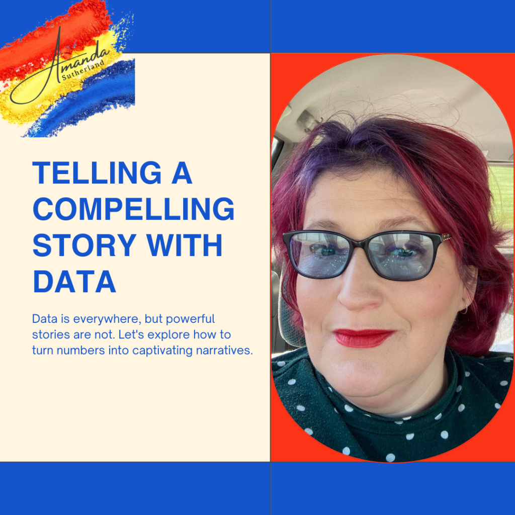
Telling a Compelling Story with Data
In the realm of infographics, transforming raw data into a compelling story is an art that not only communicates information but also engages and resonates with your audience. Let’s delve into the intricacies of telling a story with data, leveraging Canva’s versatile tools: Choosing the Right Visualization Tools: Data visualisation is not just about presenting…

In the realm of infographics, transforming raw data into a compelling story is an art that not only communicates information but also engages and resonates with your audience. Let’s delve into the intricacies of telling a story with data, leveraging Canva’s versatile tools:
Choosing the Right Visualization Tools:
Data visualisation is not just about presenting numbers; it’s about selecting the right tools to convey complex information in a visually appealing manner. Canva provides a diverse array of visualisation tools, from bar graphs to pie charts and beyond. We’ll guide you through the process of choosing the most effective tools for your specific data, ensuring clarity and impact.
Infusing Narrative into Numbers:
Numbers alone can be dry, but when woven into a narrative, they become a powerful storytelling tool. Explore techniques to go beyond basic data representation and infuse emotion and context into your infographics. Whether you’re presenting quarterly sales figures or survey results, learn how to make your data not only informative but also captivating.
Highlighting Key Insights with Visual Elements:
Canva’s toolkit includes a wealth of visual elements designed to enhance your data storytelling. Icons, colour schemes, and other graphic elements can be strategically employed to highlight key insights and draw attention to crucial information. We’ll explore how these elements can elevate your infographic, making it more engaging and memorable.
Creating a Cohesive Data Story:
A cohesive data story is more than just a collection of charts and graphs. We’ll delve into the art of structuring your infographic to ensure a logical flow of information. Connect data points seamlessly and guide your audience through a narrative journey that enhances understanding and leaves a lasting impression.
Ready to transform your data into captivating stories? Join our “Creating Social Media Templates Using Canva Masterclass” on February 21st, 2024. Reserve your seat now: subscribepage.io/ed8cvs. Let’s elevate your data storytelling game!


